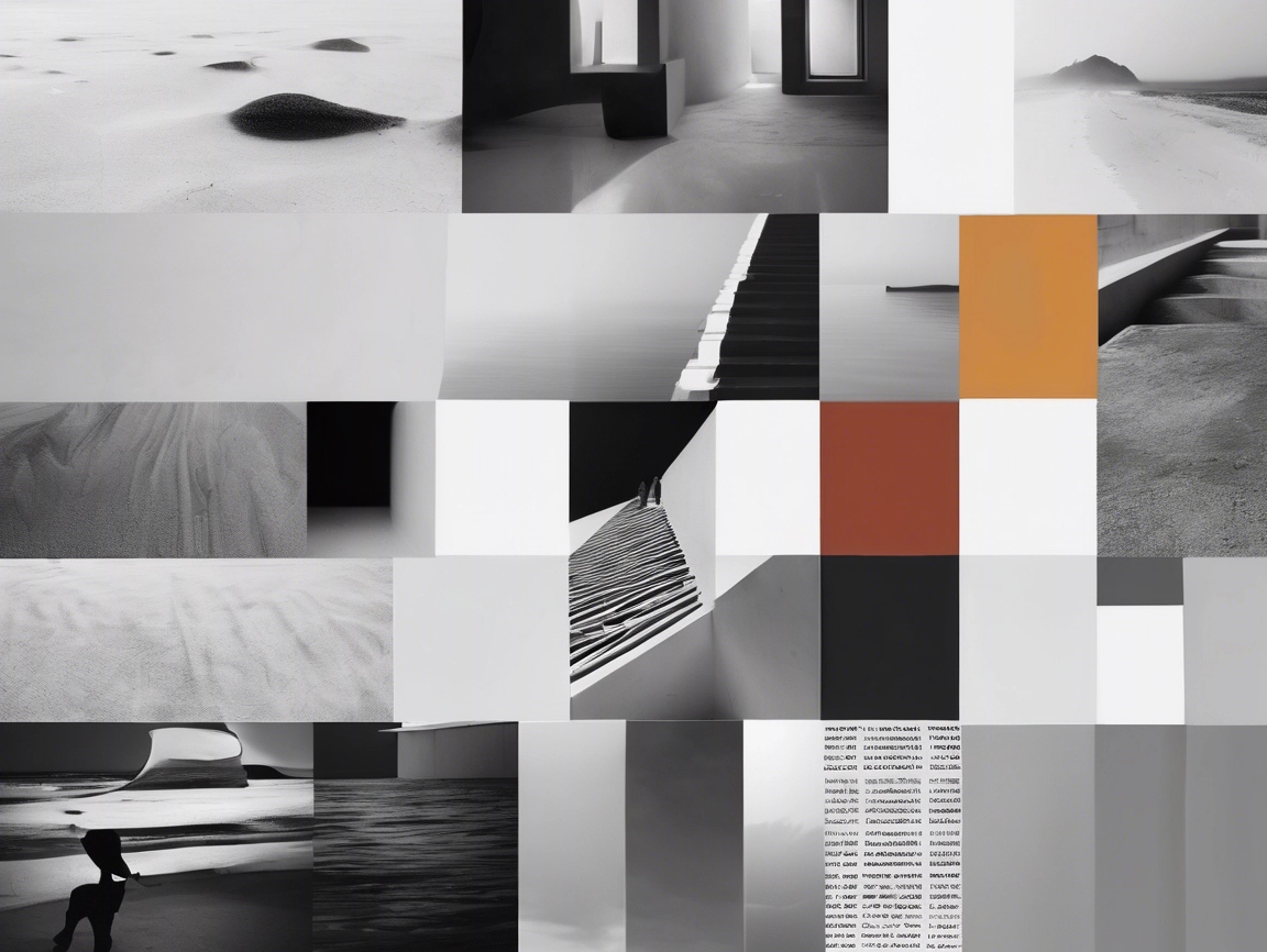
The Foundation of Visual Communication
Mastering graphic design fundamentals is key to building strong visual communication skills. Graphic layout is more than just placing text and images together—it’s the foundation of visual storytelling. Whether you’re an aspiring designer or a creative professional looking to strengthen your visual communication skills, understanding graphic layout fundamentals is essential.
These principles empower you to design visually appealing, emotionally resonant, and user-friendly layouts that leave a lasting impression.
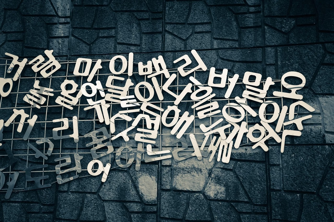
1. Lines: The Core of Visual Direction

Lines are the most fundamental element of any design. They guide the viewer’s eye, create emphasis, and establish visual structure. Lines come in various forms:
Straight or Curved – Imply precision or fluidity
Thick or Thin – Affect mood and impact
Jagged or Smooth – Create a sense of energy or calmness
You’ll find lines everywhere—from website borders to branding assets. They help create balance, divide sections, and draw attention to focal points. In logos and marketing material, designers use lines to ensure visual clarity and highlight brand identity.
Pro Tip: Use grid lines in your layout software to maintain alignment and visual order.
2. Shapes: Building Blocks of Composition
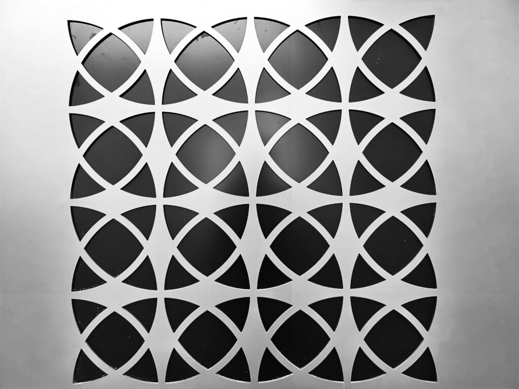
Shapes define structure in a layout. They are broadly categorized into:
- Geometric Shapes (circles, squares, triangles): convey stability and order
- Organic Shapes (irregular, freeform): bring uniqueness and creativity
In both minimalist icons and complex illustrations, shapes play a major role. UI/UX designers use them to craft intuitive buttons, form fields, and interactive sections that enhance user experience while maintaining visual appeal.
📚 Want to learn more about shape psychology in design? Check out Interaction Design Foundation for deeper insights.
3. Form: Adding Depth and Realism

Form turns flat elements into lifelike, three-dimensional visuals. This can be achieved using:
Shading and Lighting – To simulate depth
Perspective Techniques – To create spatial illusions
Shadow Effects – To add emphasis
Form is crucial in illustrations, icon design, and product mockups. Even in flat design styles, subtle shadows and gradients can make an interface feel layered and realistic.
4. Texture: Enhancing Sensory Experience

Texture refers to the surface feel of an element—either real (tactile) or implied (visual). It creates visual interest and adds dimension. Examples include:
Grunge or Paper Textures – Evoke a rustic, handmade look
Smooth and Glossy Surfaces – Suggest modernity and sleekness
Used in backgrounds, text treatments, and branding, textures make your design more immersive and emotionally impactful.
5. Color: The Psychology of Visual Impact

Color is one of the most powerful tools in a designer’s toolkit. It influences emotion, behavior, and perception. Key components include:
Color Theory – Understanding harmonious combinations
Color Psychology – Red for passion, blue for trust, green for nature
Contrast & Harmony – Ensuring readability and aesthetic balance
Effective use of color enhances storytelling and usability. Brands like Coca-Cola and Spotify strategically use color to strengthen recognition and evoke emotion.
🎨 Use tools like Coolors to create color palettes that match your design’s tone and message.
6. Typography in Graphic Design Fundamentals
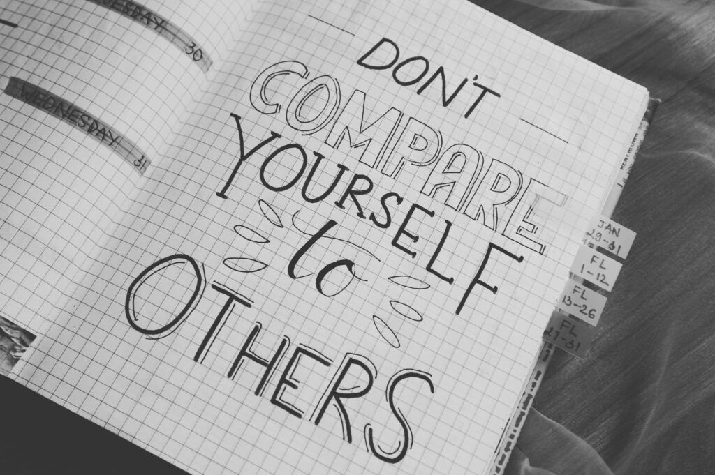
Understanding typography is one of the core graphic design fundamentals that influences readability and tone. This is not just about picking a pretty font. It’s about making text clear, visually pleasing, and emotionally appropriate. Essential principles include:
- Font Choice – Serif for tradition, sans-serif for modernity
- Hierarchy – Differentiating headlines from body text
- Spacing & Alignment – Ensuring readability and structure
Proper typography ensures your message is readable and compelling. Adjusting kerning (space between letters), leading (space between lines), and tracking (letter spacing) can significantly improve clarity.
7. Balance in Graphic Design Fundamentals

Balance ensures that no part of your design feels heavier than the other. There are several types:
Symmetrical – Equal distribution on both sides
Asymmetrical – Uneven but visually balanced
Radial – Elements radiating around a central point
Well-balanced designs feel intentional and visually satisfying. Even asymmetry, when done right, can lead to dynamic, effective layouts.
8. Contrast: Creating Focal Points

Contrast helps elements stand out and adds visual interest. You can achieve contrast using:
Color – Light text on dark background, or vice versa
Size – Enlarging headlines to catch attention
Font Weight – Mixing bold and thin text styles
Contrast is especially important in call-to-action sections, headings, and UI elements to guide users through your content effectively.
9. White Space: The Power of Simplicity

Also known as negative space, white space is the area between elements in a design. Its benefits include:
Improved Readability – Prevents visual clutter
Emphasis – Draws focus to key content
Clean, Professional Look – Associated with premium branding
In web and app design, generous white space enhances user experience by offering visual breathing room and reducing cognitive load.
10. Alignment: Establishing Order and Consistency

Alignment ensures that all design elements follow a structured visual path. This includes:
Left, Right, or Centered Alignment – Depending on the layout purpose
Grid Systems – Especially useful in web design
Spacing Consistency – For professional polish
Proper alignment builds trust and guides the viewer through your content effortlessly.
Final Thoughts on Mastering Graphic Design Fundamentals
Whether you’re designing for web, print, or social media, always return to the graphic design fundamentals to ensure balance, clarity, and impact. Understanding and applying these graphic layout fundamentals will significantly elevate your design game. Whether you’re working on social media content, branding, web design, or print materials, these principles offer a reliable framework to build from.
Design is a continuous learning journey. Keep experimenting, take design courses (such as those on Coursera), and stay inspired by the work of others. The more you practice, the more intuitive these fundamentals become.
✨ Remember: Great layout isn’t just about how it looks—it’s about how it works.

2 Comments on “Graphic Design Fundamentals Every Beginner Should Know”